Work
A snapshot of our projects.
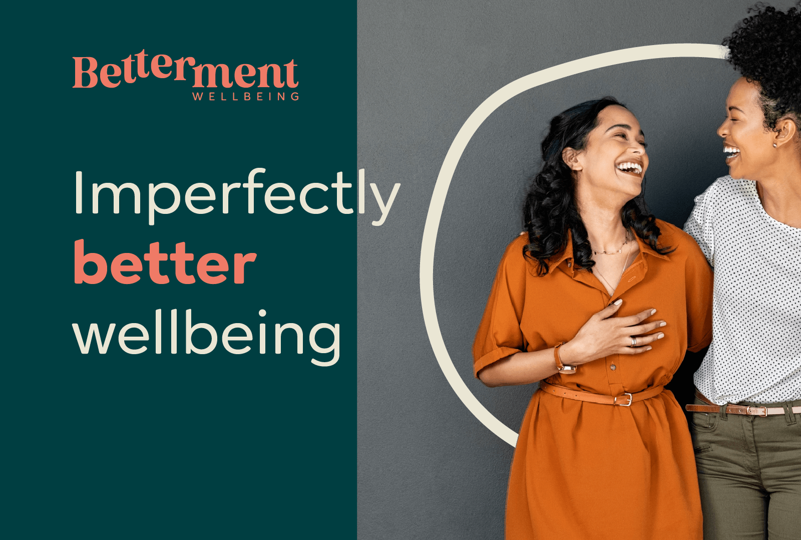
Betterment
Betterment. A new, realistic approach and mindset to live better. Betterment is run by real people who help others succeed at improving their wellbeing in their own unique way and without the pressures to become their ‘best self'.
They required a strategy, tagline and strong visual brand presence to cut through the wellbeing ‘noise’ and not get lost in the sea of wellbeing offerings.
Deliverables: brand strategy, tagline, logo, visual identity, animation, marketing materials
“We love it, you’re brilliant! So grateful for all your work on this. It has felt so easy working with you and we're blown away by where you have got us to in such a short timeframe. Looking forward to the next chapters.”— Camilla Thompson and Martine Beaumont, Founders, Betterment
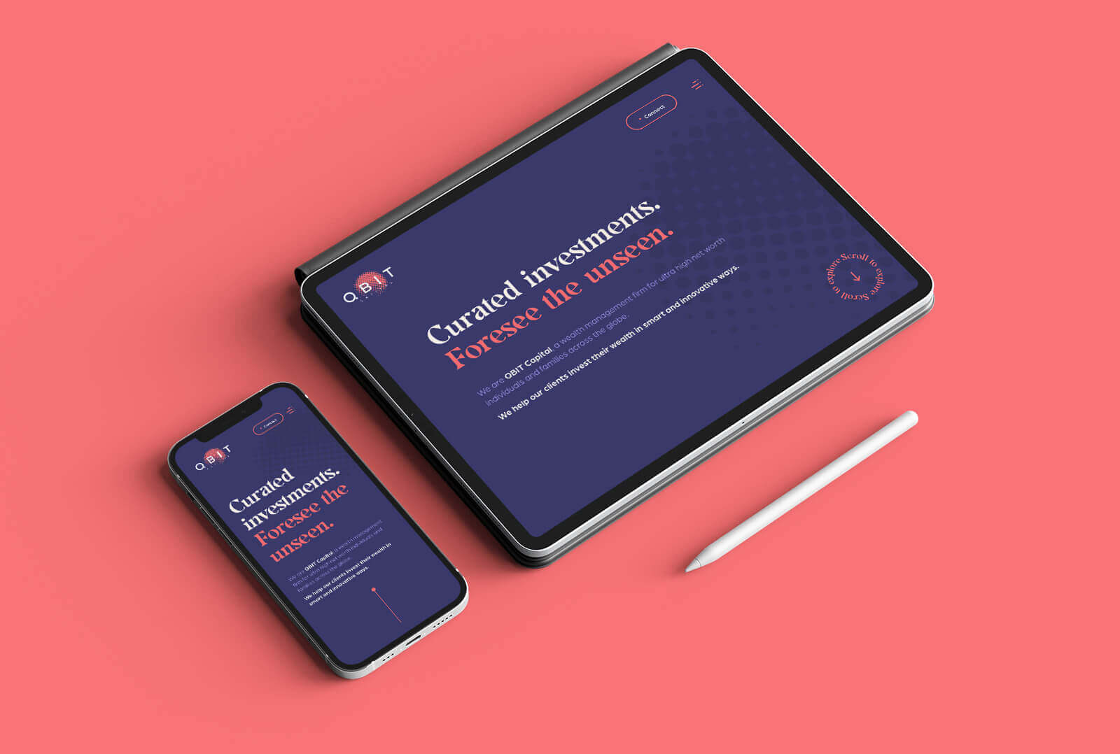
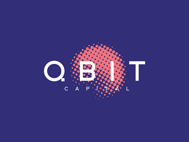
QBIT Capital
QBIT Capital is a wealth management firm for ultra high net worth individuals and families across the globe. Their objective is to “bring innovation and disruption into capital management”.
Their new tagline, ‘Foresee the unseen’, plays strongly to the ‘one step ahead’ mentality of the brand; helping clients invest in new, bold and unique global ventures. The logo is a reflection of QBIT’s specificity, global connections and collaborations, innovative nature, and unique strategic positioning.
Deliverables: brand strategy, tagline, logo, visual identity, animation, website design/development, marketing materials
“The impact has been instrumental! Building a new brand is not an easy task. Sophie took all the necessary time to better understand what I was trying to build, achieve and communicate. She challenged the thought process, guided me in defining the path, and made it fun and enjoyable. She also helped us build a website that really reflects our identity.”— Georges Khneysser, Founder, QBIT Capital
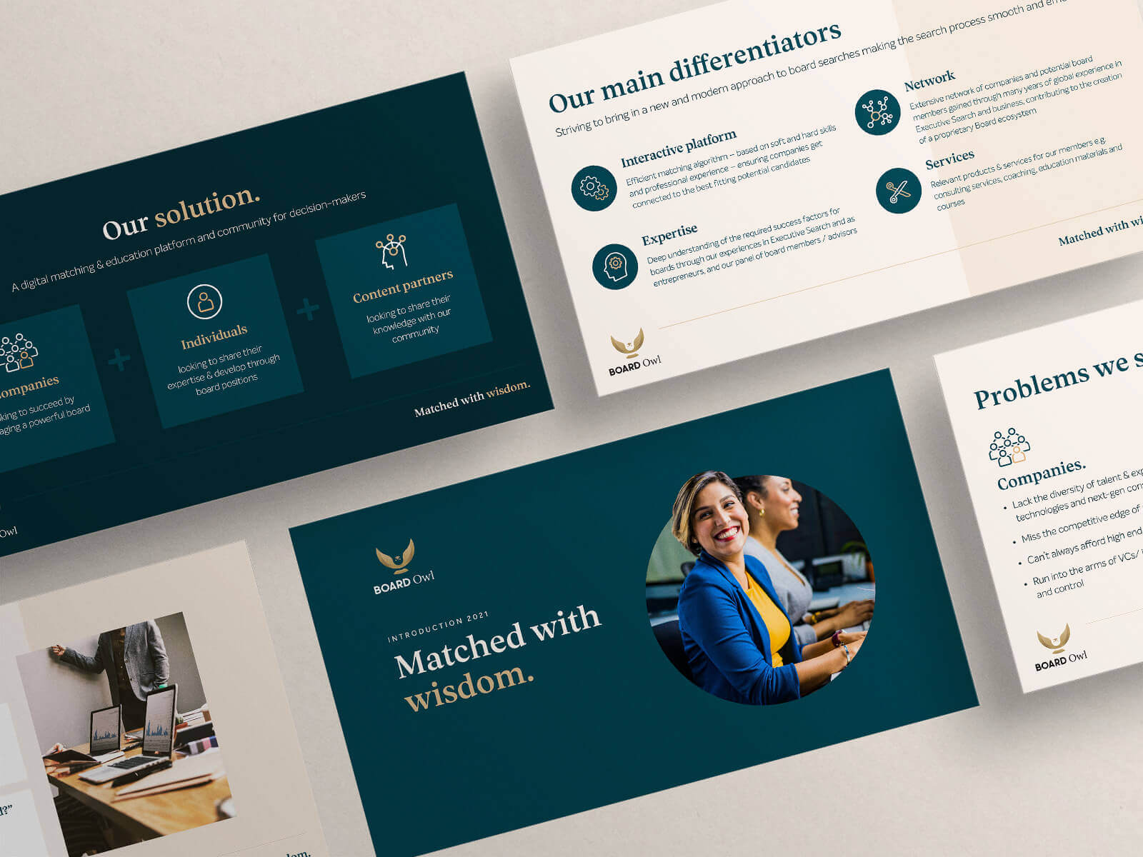
Board Owl
Board Owl is a digital matching platform and community for companies looking to leverage a powerful board, and individuals looking to share their expertise and develop through holding board positions. Their goal is to “be recognised for owning - and excelling in - our market place.”
Their new tagline, ‘Matched with wisdom’, empowers individuals to harness their best selves with the trust that Board Owl has the knowledge, experience and wisdom to match them with the right organisations. It also assures companies that Board Owl operates with deep experience and expertise in matching the right candidates to their board positions.
Deliverables: brand strategy, tagline, logo, visual identity, website design, marketing materials
“Sophie helped us define and implement our brand strategy, visual identity and website - our entire team found the process fantastic. We highly recommend working with her.” — Delphine Trabaldo Togna, Co-founder, Board Owl
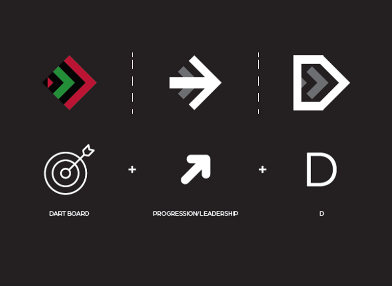
DART Talent & Executive Search
DART is a multi award-winning Swiss executive talent search boutique specialising in asset and wealth management worldwide. Their brand's objective is to “to stand out for what we stand for and are capable of'.
DART thrives on helping others thrive, and their new tagline, ‘Discover the Distinctive’, boldly empowers others to set out on their own journeys to experience finding the unexpected and the extraordinary. DART’s new logo plays on the letter ‘D’, as well as creating an abstract shape of a dart board and the flight of a dart. The shape has been angled as an arrow to signify progression and leadership.
Deliverables: brand strategy, tagline, logo/visual identity, marketing materials
“The whole DART team is thrilled with our new brnd identity, and it has been a source of new energy. We enlisted the support of Forest Found to refresh our logo and branding to better reflect the values, principles and emotions our business has evolved to over the last 14 years of business since inception. The FF team did a wonderful job of carefully guiding us through exercises on brand personality. They understood the needs and demographic of our target clientele, and delivered us great visuals and taglines with wit and class, to a clear timeline.” — Daniel Aghdami, Co-founder and Managing Partner, DART
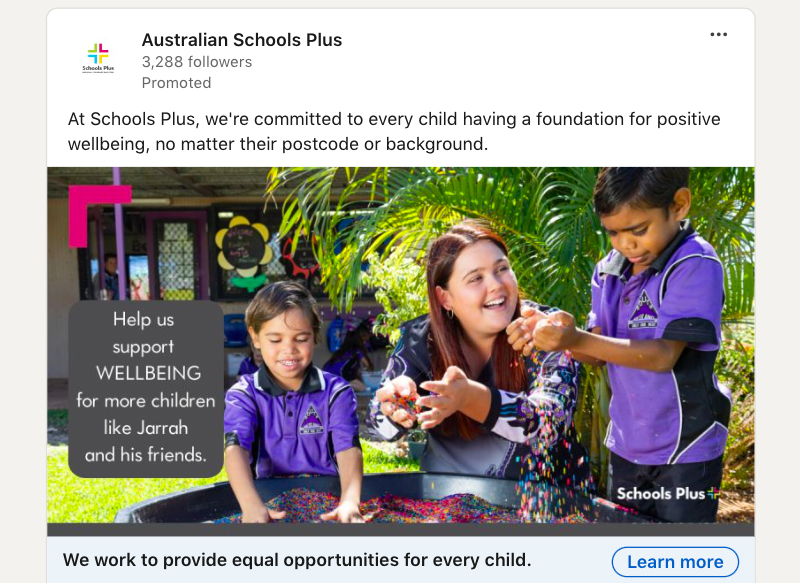
Australian Schools Plus
Australian Schools Plus is a national not-for-profit founded to support the need for philanthropic funding in schools to help close the education gap caused by disadvantage. Since 2014, Schools Plus has raised $68 million, worked with 1500 schools and positively impacted over 500,000 children nationally.
Schools Plus is in the process of accelerating their marketing initiatives and required support with Google Ads and LinkedIn Ads. Forest Found facilitated two training workshops to educate the team on how best to use and maximise these platforms effectively, including a focus on keyword planning, setting up campaigns, creative recommendations and results analysis.
Deliverables: Google Ads and LinkedIn Ads training
“We wanted to go forward in leaps and bounds with our ads, and with Sophie’s training we’re already there, just four days into our campaign.” — Katie Breden, Marketing Specialist, Australian Schools Plus
Waterfront Alliance
Waterfront Alliance is a US based nonprofit organisation with a growing coalition of more than 1,100 partners and shared goal: to bring about real change to the New York-New Jersey region’s waterways and 700+ miles of shoreline, and beyond on a national level.
The organisation required “direction, clarity and a clear message” to demonstrate that they are “much more than a convener”. One of their key challenges was connecting with the next generation, whom will be instrumental in advocating and supporting the organisation to drive its success long into the future.
Our process was deep and broad, including public brand perception research, staff engagement and multiple stakeholder workshops.
Deliverables: brand strategy, tagline

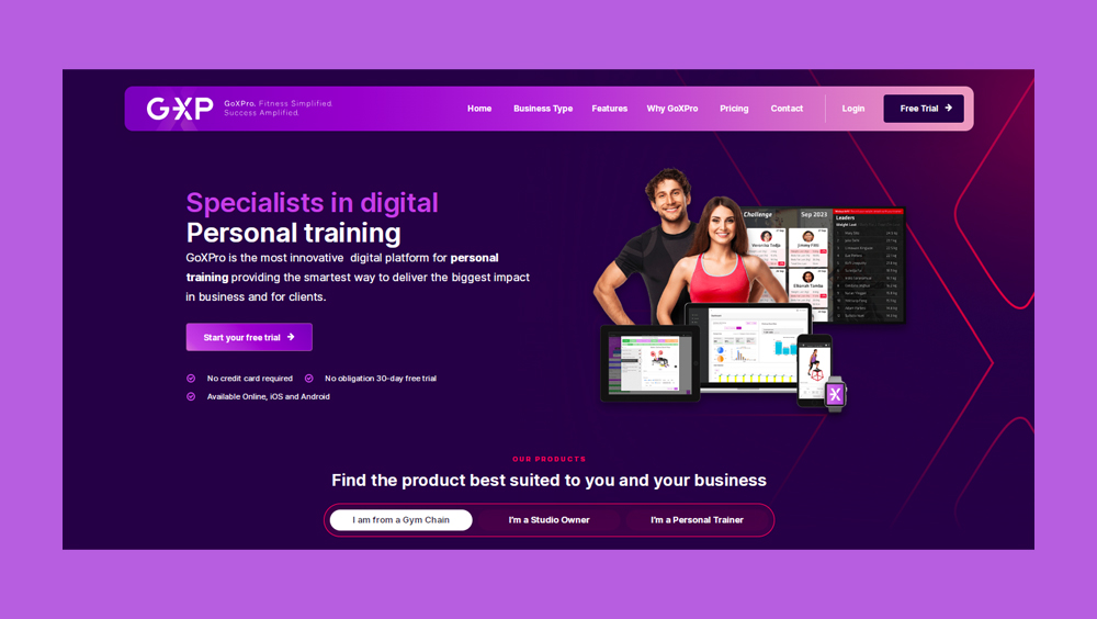
GoXPro (GXP)
Already established as a credible player in the fitness industry, GoXPro was ready for an energetic new brand and website upgrade to propel into a leadership role within the sector.
The new logo differentiates GXP, both with its vibrant and bold colour palette to stand out within the busy fitness brandscape, and by representing a shortened 'GXP' to extinguish any confusion with similarly named brands. Great consideration was given to the UX design for the new website to ensure the highest quality user experience for each of GoXPro's key audiences.
A highly detailed marketing strategy blueprint and go-to-market plan were also produced in line with the brand work.
Deliverables: brand strategy, logo/visual identity, website, content writing, marketing strategy, marketing materials, animations
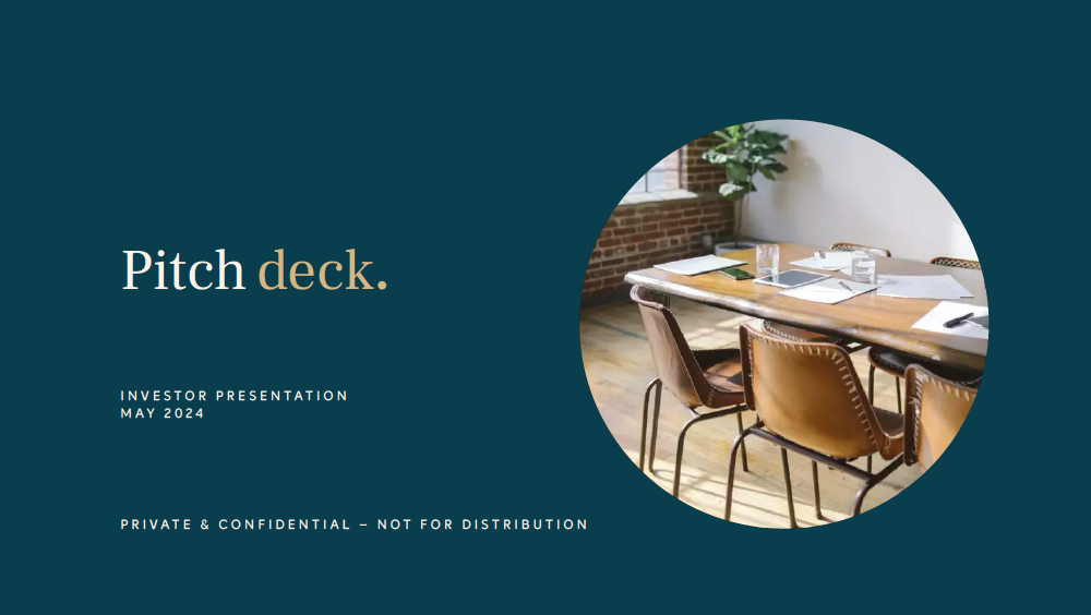
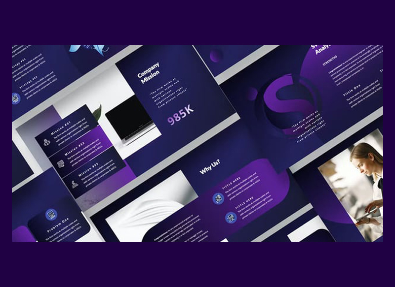
Investment pitch decks (multiple clients)
We work with multiple clients to produce high quality investment pitch decks.
A well-crafted pitch deck is essential for any startup that’s looking to raise funds. From concept to delivery, we’re here to collaborate and create presentations that leave a mark, turning potential into prosperity.
Deliverables: strategic direction, content writing/editing, design
“Sophie has been an absolute godsend... recently I have put her to the test with some high priority design work for a presentation to a large corporate client - Sophie made us look so professional and that went a long way to us getting the deal. I couldn't recommend her highly enough” — GK, Director & COO, FOLK Group
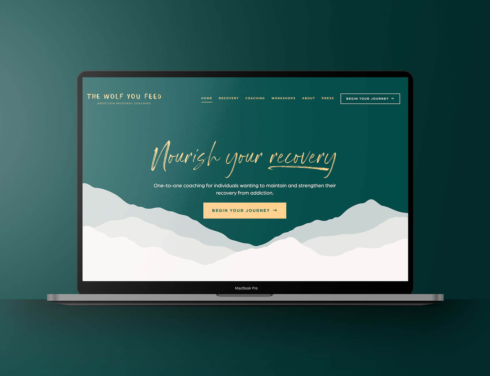
The wolf you feed
The wolf you feed has one main goal: to help others attain and maintain long term recovery from addiction. The entire brand - from tone of voice to visual identity - needed to portray warmth, safety and inspiration for individuals to take the next step.
Their new tagline, ’Nourish your recovery’, plays to the brand’s name and emphasises the crucial message that one must nourish themselves in order to succeed on their journey.
Deliverables: brand strategy, tagline, logo, visual identity, website, marketing materials
Other work (with Grindstone)
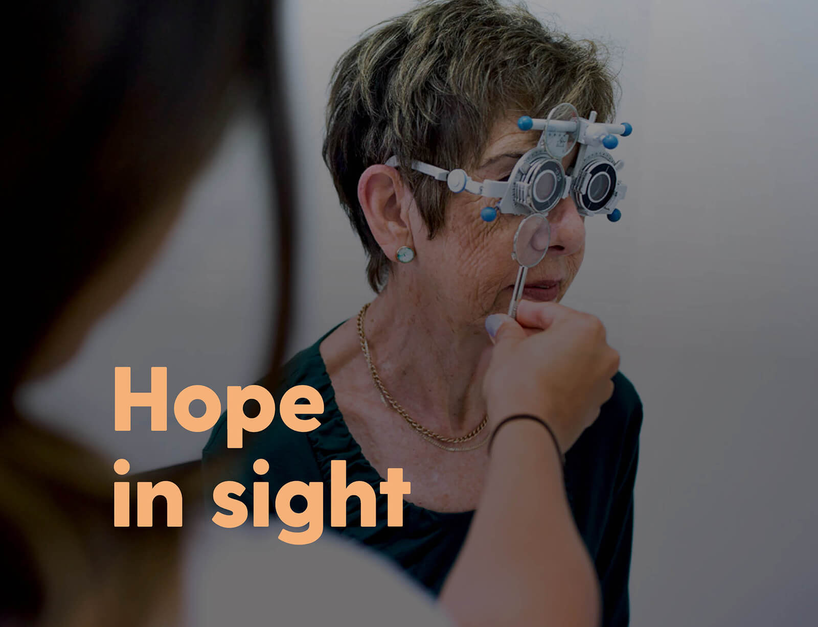
Centre for Eye Research Australia (CERA)
CERA required a brand narrative to generate more philanthropic income to support its world-leading research, and strengthen its presence and reputation with key stakeholder groups.
Their new tagline, ‘Hope in sight’, and complementing narrative symbolise positive ambition and instil faith.
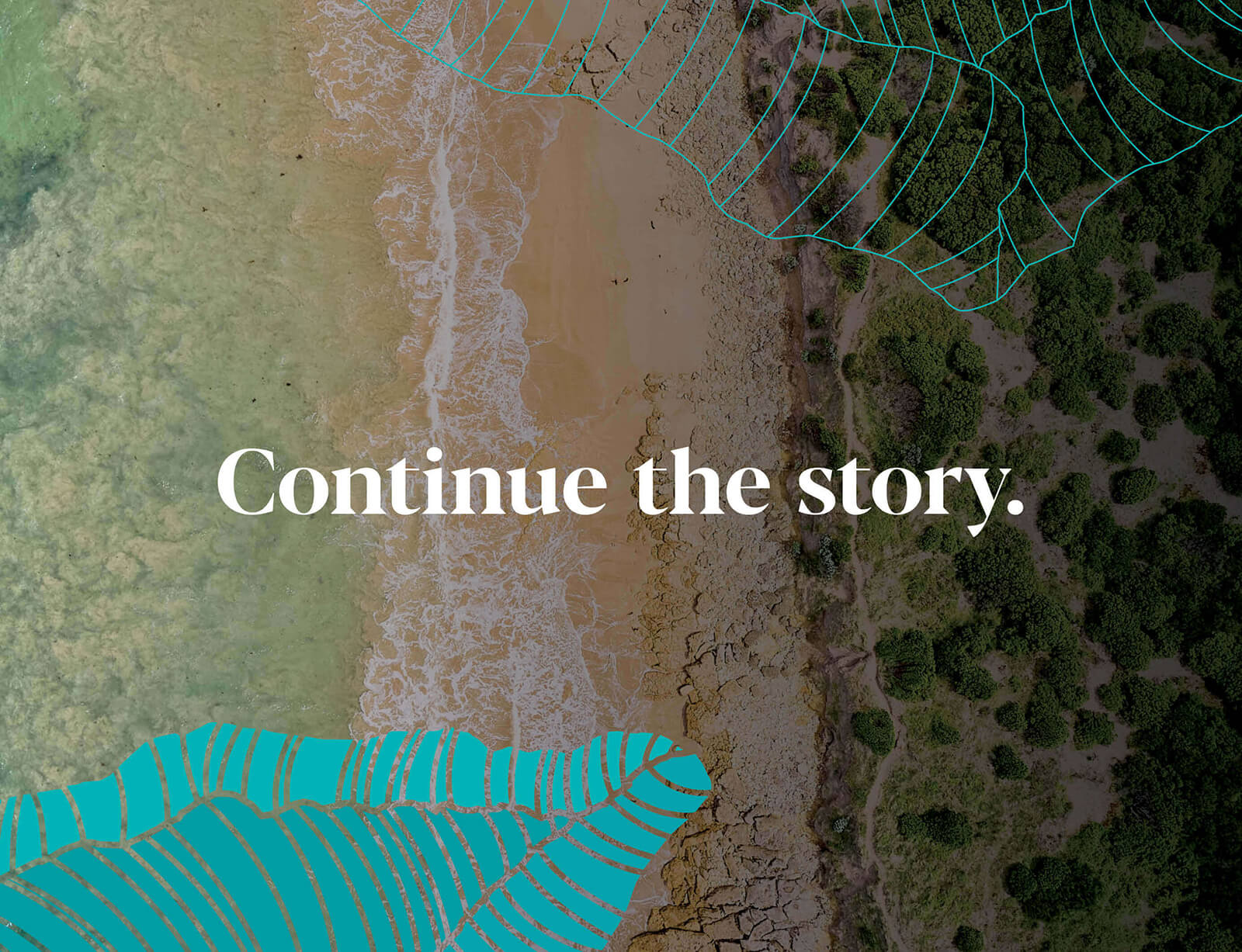
Great Ocean Road Coast and Parks Authority
The greatest challenge for the new Authority was to balance management of the liveability of local communities and enhancing the visitor experience, with its fundamental role of protecting the environment for the benefit of future generations.
Their new tagline, ‘Continue the story’, honours sharing the history, values, practices and lore of the Traditional Owners, and empowers present and future generations to collectively care for the Great Ocean Road Coast and Parks.
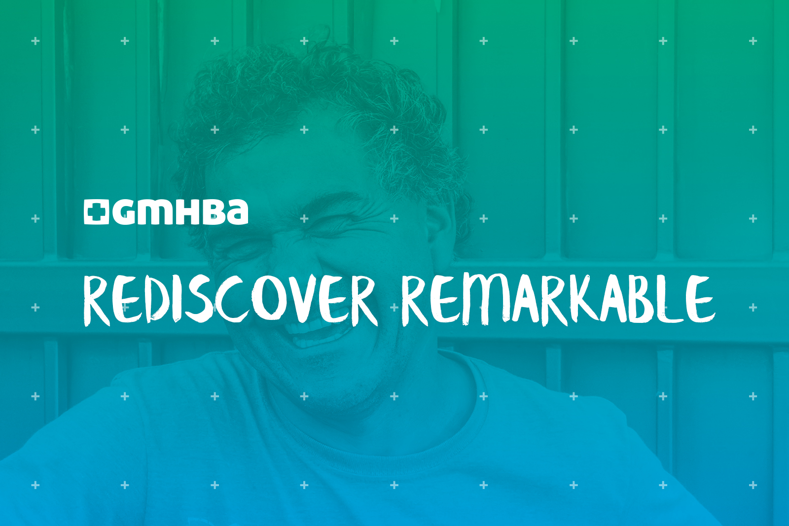
GMHBA
GMHBA required a employer brand strategy and powerful Employee Value Proposition (EVP) to invigorate their positioning with existing and potential employees to answer the question: “Why should I work for your company instead of somewhere else?”
After a challenging pandemic in which life experiences have been less than remarkable for most of us, their new tagline, ‘Rediscover remarkable’, weaves in one of their brand values and offers a powerful career promise at GMHBA.
"A clear strategy is the crucial foundation of a smart brand that audiences connect with, trust, advocate, and buy from." — Sophie Aghdami